What would it look like if famous apps were designed in the 80s and 90s?
Here’s a fun thought experiment. What would the apps you use everyday look like if they were around in the 80s and 90s? Instagram, Twitter, Facebook, Google and all the other digital services we learned to take for granted. Naturally, mobile phones were more like 5 kilo “brick” phones back then, so you’d have to focus on the desktop version. Then, you’d have to take into account various graphic cards, like CGA, EGA, or VGA, and take account the ultra fast 14.4 Kbps modems. On the other hand, there was only one dominant operating system – DOS, and then Windows.
Some very creative people have turned this thought experiment into a reality, at least on the visual concept level, and produced the cool designs you’ll see below.
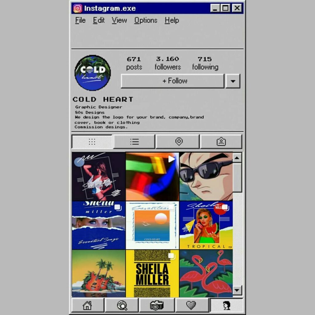
The first one is coldheart80s, who visualized how IG would have looked like back in the days. coldheart80s also runs a pretty neat IG page, as well as selling his designs on Redbubble.
Another prominent dreamer is Squirrel Monkey, whose YouTube channel covers most of the popular apps today.
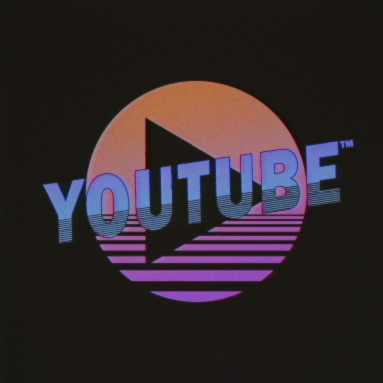
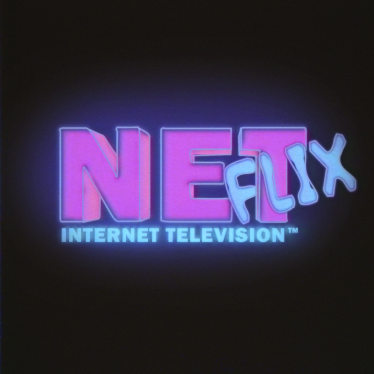
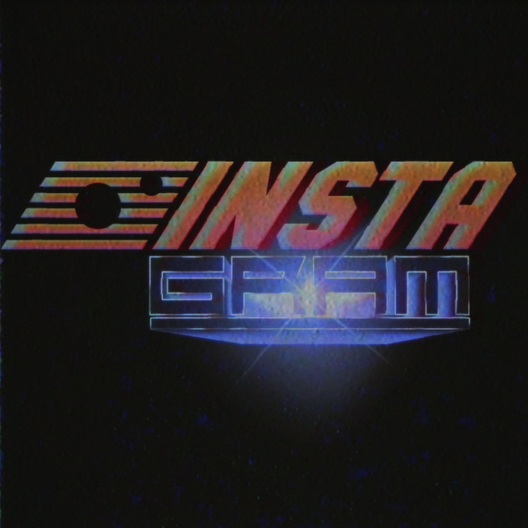
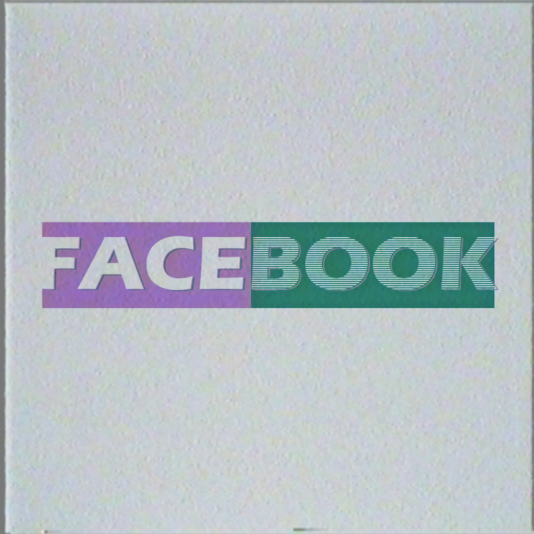
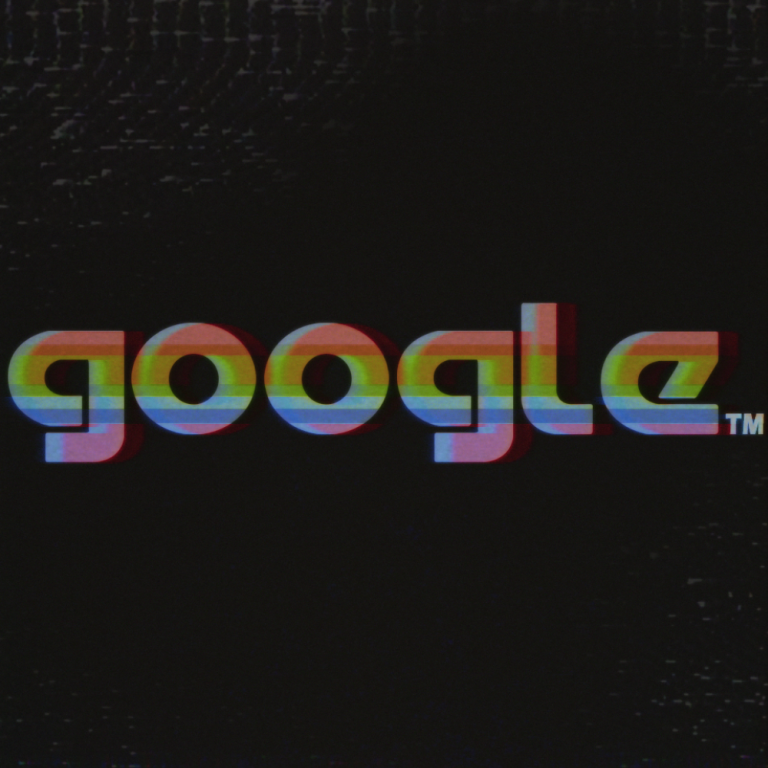
Modern Tech Logos in the 80s and 90s
Other than visualizing the UI of the apps, some designers also focused on designing the logos for these popular services, with an 80s and 90s graphic touch. RealFuturePunk offers his take on matter, including even Internet companies who were around in the 90s, like Amazon and eBay.
Follow Retrogeist on Twitter!
Follow @retrogeist